In order for us all to work on our own seperate parts and to have them all in the same scene without exporting/importing them in and wasting time, I learnt how to do referencing.
The parts I am modelling are most of the furniture objects. This includes Booths, tables and chairs. Referencing this means instead of creating one object like a booth and importing it later then creating a table and importing that, I could just create a reference of where the objects WILL be WHEN they are made. So when they are completed I can move the files in and it will automatically be in the scene.
The only problem with this is that there needs to be something there so that Daryl can start animating whilst me and harrison are modelling. This is where Proxy referencing comes in.
Proxy referencing is like linking a reference to another set of files, which you can easily switch between. In this case, I made 'proxy' versions of my furniture which is basically blockout furniture. I can then concentrate on creating the proper models to put in whilst Daryl can animate. When the files are done, I put them in the folder and just switch the reference from proxy to proper!
Blockout-like furniture
Friday, 30 November 2007
Friday, 2 November 2007
Paris Texas - Research from Film
These are some examples of a road and sign posts in a desert environment. This can be very good reference to use when creating our environment, for a road outside our diner.
These shots are some good examples of a rundown building, also similar to a diner, but in a much different style to our own. Other than style though this can still be very helpful in getting the aesthetic of the building right. For example, the bits of barbwire fencing outside and a barrel making it look very old, and the general dirty look to everything.
The lighting used inside is also very good reference to use, as our lighting will probably be very similar to this, but to fit in to our storyline. For example, we probably won't have blinds, but horrible blowing curtains. And in other areas parts will be boarded up. Will shall probably have more light than this, be it will still be quite dark and murky nevertheless.
These are some nice shots of rock formations in a desert in Texas. This is some good reference for the background scenery we will be needing for our environment.
Thursday, 1 November 2007
WEEK 5
This picture which I found on google I thought would be perfect to base our diner on. It seems just the right size for our diner, and enough space for our character to move around in and interact in.
This is a product dimension sheet of a 50s diner booth. I used this as a base for creating a blueprint of our diner, also based heavily on the photo above. I decided to cut out the worktop to the north of the diner as it didn't seem necessary for what we needed. Instead though, I placed a jukebox in that space, which we felt is VERY important for a 50s diner.
Rough blueprint created to scale in Photoshop.
These are some pictures from a website of 50s style diner furniture. I think this is great reference material to use when creating the environment.
These two screenshots show a rough 3D layout of the inside of the diner (part being used). I followed the dimensions of the blueprint and also scaled it round our character model which we found online. The reason for this is so that Daryl can start animating the scenes whilst me and Harrison create the models, texturing etc to place in the environment later.. basically to structure our time better.
These two screenshots show a rough 3D layout of the outsdie of the diner. Again, just for a base for Daryl to work on.
WEEK 4 - Specific Research
These are some pictures of 50s diners. I like these, mainly for the shape and 'futuristic' design of the buildings. The first is kool because of how tinny it looks, kind of like a toy building. The colours are quite funky too. The second is also quite good, perhaps not as good as the first but the massive signpost is quite cool.
Again I like the title of the diner on the sign going through the building, but the rest of the building looks really boring. This may be good t oduplicate in 3D though for an authentic rundown diner in the middle of nowhere.
This is evidence of a COMPLETELY DESTROYED diner. We probably wouldn't want to have a diner THIS bad, but i thought it was interesting how the sign is intact.
This diner I htink is brilliant. It's really cool looking and quite simple. Inside, though cramped for a character to go through, has a lot to work with. lots of seats, stools, tables etc. I think we will probably copy a lot of things from this picture, like curtains/windows, and the general look and possible layout.
This is a finished animatic of our story from Daryl's drawn storyboard.
Basics of what happens...
The character has arrived at the diner and is looking at his make to make sure he has found the finest gherkin diner in the world. He looks away from his map towards the diner, walks up and enters it. He is shocked to see the inside of the diner is completely run down, unlike the near perfect outside.
The character then starts to take pictures of the building in reference of the once established famous Gherkin diner. He travels round the room taking picture after picture until he finds a remaining Gherkin. He grabs the Gherkin jar and the story ends.
Monday, 22 October 2007
WEEK 3 - Barcelona Pictures.. FINALLY up!
These are photos from a locational shoot in Barcelona. I had taken over 200 photos in total but unfortunately erased about 150 of the pictures by accident.. but here are some from the collection I didn't manage to delete.
This is a beutiful photo of a Hospital in Barcelona. It is so different in comparison to a hospital in Britain. The design is so marvelous and flawless and any part is either sculpted or painted. Making an environment of buildings like this would be hard to do, but would look amazing, especially if I did it in my own style.
This is one of many buildings I had taken pictures of. So many buildings were created in so many similar and different styles. Mainly Gothic, apart from the surreal works of Gaudi.
I wouldn't mind doing an environment like this because of how good it looks.
These are just some photos of street lights from the streets of Barcelona mainly because of how intricate the detail is. It's also quite gothic which i kind of like. They are taken from different parts of Barcelona and are really unique. I also like the artists' branding/signiture on the work itself. I would love to create something as nice as these in Maya.
These pictures are part of a complex of more of Gaudi architecture. These were mainly taken for research on rocky textures and the way tehy can be formed together to create paths such as the cool alleyway shown.
These are some more walls and pillars made from rocks and bricks. It's really nice with the palm trees also. The thing i like the most about these is that they look like they are almost incomplete, yet still standing.
These were next to the previous architectures. It is basically a giant room with pillars holding up the ground above and completely filled in mosaics, but mainly white. This was probably to make the center piece stand out more (the colourful weird parts).
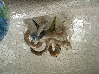
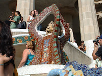
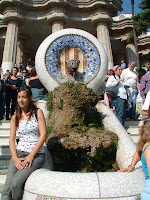
These are some more of Gaudi's buildings and architecture. Like before, focusing on more mosaics. Some of these are used alongside plants and one even representing an animal of some sort. I think it's quite interesting but personally I don't really like these as, to me, they just seem boring.
these on the other hand, I though could be quite cool to use as textures for something else. These ore from a wall, but perhaps used as a floor texture or artwork on their own would be nice.
This video I cannot embed on this blog but I thought was really cool. I have no idea who it is made by but it's really dark and modeled andanimated really well. It's very surreal and dark but so interesting.
LINK <<============================================================
This is a beutiful photo of a Hospital in Barcelona. It is so different in comparison to a hospital in Britain. The design is so marvelous and flawless and any part is either sculpted or painted. Making an environment of buildings like this would be hard to do, but would look amazing, especially if I did it in my own style.
This is one of many buildings I had taken pictures of. So many buildings were created in so many similar and different styles. Mainly Gothic, apart from the surreal works of Gaudi.
I wouldn't mind doing an environment like this because of how good it looks.
These are just some photos of street lights from the streets of Barcelona mainly because of how intricate the detail is. It's also quite gothic which i kind of like. They are taken from different parts of Barcelona and are really unique. I also like the artists' branding/signiture on the work itself. I would love to create something as nice as these in Maya.
These pictures are part of a complex of more of Gaudi architecture. These were mainly taken for research on rocky textures and the way tehy can be formed together to create paths such as the cool alleyway shown.
These are some more walls and pillars made from rocks and bricks. It's really nice with the palm trees also. The thing i like the most about these is that they look like they are almost incomplete, yet still standing.
These were next to the previous architectures. It is basically a giant room with pillars holding up the ground above and completely filled in mosaics, but mainly white. This was probably to make the center piece stand out more (the colourful weird parts).
These are some more of Gaudi's buildings and architecture. Like before, focusing on more mosaics. Some of these are used alongside plants and one even representing an animal of some sort. I think it's quite interesting but personally I don't really like these as, to me, they just seem boring.
these on the other hand, I though could be quite cool to use as textures for something else. These ore from a wall, but perhaps used as a floor texture or artwork on their own would be nice.
This video I cannot embed on this blog but I thought was really cool. I have no idea who it is made by but it's really dark and modeled andanimated really well. It's very surreal and dark but so interesting.
LINK <<============================================================
Subscribe to:
Posts (Atom)