Now is the time of rendering. We all messed around with lighting, Harrison the most. Although most of this was in mental ray which for some reason skrewed up for us and NO ONE could fix.
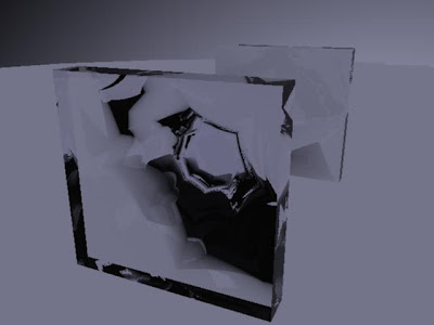
This is a glass brick i did that looked really ugly on its own but really good in mental ray (which of course we couldn't use). So Harrison made a more attractive glass brick and put it in the scene.
I also did the editing. Which looked good. There was a few things that didn't match up or had to be done. For example there was two door scenes rendered where the character opens the door. one is shot from outside set, the other from the inside set. The frames that lin kthem though are different AND different lighting. To fix this I did a simple transition between them, keyed out around the inside door to make it brighter and faded it into the scene's colour to be the transition. I didn't actually used the transtition effect within premoere Because there was still an obvious cut i made a blur between them. I also experimented on one from with some lightning for some eye veins. It's not necassary at all but it was fun to do.
And this is the camera flash part. To do this I just used the normal transition effect on premiere between a pure white frame. Along to the sound this works perfectly.
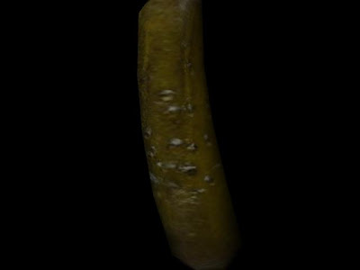
And finally here is the gherkin i modelled which i forgot to do before.. which of course is the most IMPORTANT model! :P
Friday, 30 November 2007
WEEK 8 - More texturing
Modelled Planks of wood
Here are some wooden planks created and textured quickly. Its a bit late for the schedule but nothing too drastic.
Here is the texture i used. I cut out four panels so they look different from each other.
here are the final boarded up windows. I used the nails from before to put around the wooden panels also.. again for realism.
Here is from the side.. with basic lighting.
Here is the texture i used. I cut out four panels so they look different from each other.
here are the final boarded up windows. I used the nails from before to put around the wooden panels also.. again for realism.
Here is from the side.. with basic lighting.
Jukebox Texturing
This is the final texture for the jukebox. Its not brilliant and it only uses simple textures taken from a photo of the jukebow. Except for the light wood texture which was from a seperate file. The lights were done with a simple blinn. As they weren't going to be 'on' and colourful anyway.
Overall though I think the jukebox worked quite nicely, but is best when seen from a distance :P
Week 7 - UV Mapping
This is the UV (placed on the model) of the booth.
This is a texturing test on the booth uv which worked fine!!! :D
This is the texture I made. I did simple colours then put a leather texture over it, all in photoshop. I thought this was cool but I thought it could do with some more dirt.
This is the dirtier texture which I think Is good enough.
Jukebox Modelling
For the jukebox i used this image as reference.
And after hours i had this made! I never realised the jukebox would be so hard to do so I think I won't have enough time (or energy) to do much detail.
And here is the final design after hours and hours and HOURS!!!
I'm happy with it but not too happy. It could of been a lot better but it was just taking far too long so I had to leave out small details like metal parts around the jukebox.
Here is it in scene. Basic Render.
This is wood put up on the jukebox and modelling the inside would have taken too long. I also had no reference of what it looked inside, so this was the best option. Simple low poly nails were put in too for realism.
WEEK 6 - Modelling
Im now modelling! And i'm starting with the diner booth.
To start with I kept the proxy version of the booth in the scene to use as guidelines for height and width of the booth.
These pictures are of the booth i made. It was a good start and doesn't look bad but it doesn't really stand out. So instead I made the one below.
I made this version a lot more round on the edges and put a simple design on the seat to look more liek the style of a 50s booth, but in my own style rather than copied. I also put some rough colours on just to test.
Here is the booth and the double booth in the scene.
And here are the final models.
Subscribe to:
Posts (Atom)